Good readability is absolutely crucial for good user experience.
Unfortunately, many websites have font designs that are very hard to read on some screens.
When I land on a site with a font that is hard to read, then I often simply leave and click on the next site.
I am sure that many people feel the same way. They are not willing to force themselves to consume text-based content if the font is hard to read.
One crucial fact that many webmasters don’t realize is that different fonts can look vastly different depending on the device.
For example, many website owners have Macs and use them when developing and browsing their websites. However, they don’t realize that their font may look downright terrible on Windows.
The good news is that optimizing your fonts is super simple. You only need to do it once and it is going to make your website much better for users.
And better user experience will improve literally everything that matters — your SEO performance, traffic, subscriber counts, and revenue.
This article explains how to optimize your web font styles for better readability on a screen.
Serif vs sans-serif fonts
No discussion of font design (also called typography) is complete without briefly explaining the difference between “serif” and “sans-serif” fonts.
The main difference is that serif fonts contain small lines (called serifs) at the end of long lines, while sans-serif fonts have nothing at the end of lines.
Here’s a photo from fonts.com that shows the difference:

Serif fonts are more common in print and books while sans-serif fonts are more common on the web. Both serif and sans-serif fonts can be good for web readability if they are styled correctly.
Bottom Line: Serif fonts contain small lines at the ends of longer lines, while sans-serif fonts do not. Both can be good for web readability.
Good fonts for web readability
Here are a few fonts that are great for readability on all devices and screens, if styled correctly.
This is not an exhaustive list of all good fonts, just examples for you to consider if you are looking for a new font to use.
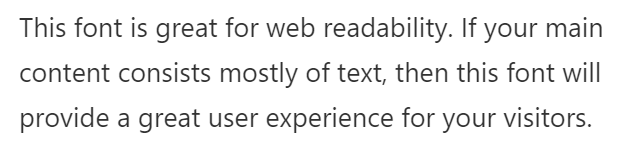
Sans-Serif: Open Sans
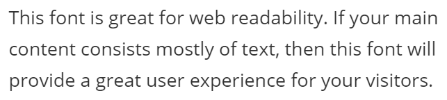
Open Sans is the font used on this site. It is my personal favorite for web readability.
It is a very popular font for text-based content and is highly versatile because it can also be used for titles and various design elements.
In fact, Open Sans is the only font I use on this site. It is used in the titles, menu, sidebar, footers and everywhere else.
Open Sans is the second most used Google font, used on over 25 million websites. This means that most people have it cached on their devices, making it load very fast.
Sans-Serif: Roboto
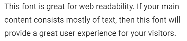
Roboto is a font that was developed by Google. It is the default font in the Android operating system and is also used on YouTube.
Roboto is the most popular Google font, currently used on over 26 million websites.
Sans-Serif: Lato
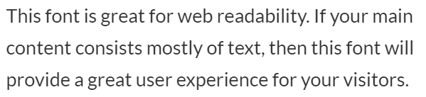
Lato is the third most popular Google font, currently used on over 12 million websites.
Sans-Serif: Arial
Arial is a web-safe font, meaning that it comes pre-installed on almost all devices.
This means that you don’t need to load an external font on your website, which can make it load slightly faster.
Arial is an old web font, but many of the world’s biggest websites still use it. This includes the web version of Google search.
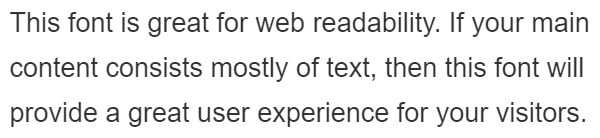
Sans-Serif: System Stack
Most modern operating systems come with pre-installed fonts that are aesthetically pleasing. These are termed “system fonts.”
If you use a system font stack on your website, then the font shown will depend on the operating system of your visitors.
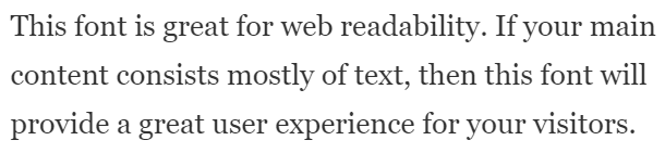
Most Apple devices will show the San Francisco font, Android devices will show Roboto and Windows devices will show Segoe UI.
The screenshot above is from a Windows device, so the font you see is Segoe UI.
Here’s the css code to add a system font stack:
body { font-family: -apple-system,BlinkMacSystemFont,"Segoe UI",Roboto,Oxygen-Sans,Ubuntu,Cantarell,"Helvetica Neue",sans-serif; }Using system fonts can make your website faster. Same as with web-safe fonts, they are already stored on your visitors’ devices so there is no need to download them before the text can be displayed.
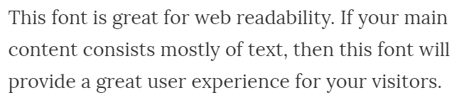
Serif: Georgia
Georgia is an old web-safe serif font that is still very popular.
It looks particularly good if you have a large font size, such as 20px or higher.
Serif: Lora
Lora is one of the most popular serif Google fonts. It is currently used on over 1.7 million websites.
Same as with Georgia, it looks fantastic at a higher font size, such as 18-20px or more.
More fonts
You can find all the different Google fonts on this page, sorted by popularity.
Bottom Line: Many fonts can make your website’s text easily readable on a screen. Popular examples include Open Sans, Roboto, Arial and Georgia.
Optimal font styles
Selecting the right font is only the first step. There are also various font styling options that are crucial for screen readability.
Font Color
Many websites make the mistake of not having a proper contrast between the font and the background.
For optimal readability, you should have black or dark gray text on a plain white background. If your text is light gray, then it will be very hard to read on some screens.
On this website, the font color is #323232, which is almost black.
Optimal font size
It is very important to consider all devices and users when deciding on the right font size.
Some people may have trouble reading small text and may not know how to zoom in with their web browser to make the text bigger.
In this case, having a very small font could make your site completely useless for many people.
For the main text of your site, a font size of 16px or higher is generally appropriate in most cases.
On this site, my Open Sans font is at 18px on desktop computers and tablets. It goes down to 17px on larger mobile devices and 16px on smaller mobile devices.
Also keep in mind that font size matters for all text on your website, not just the main text!
For example, the bylines that show the author and date should also be easily readable for everyone.
Optimal font weight
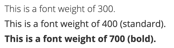
The css property font-weight affects how thick the lines of your fonts are. A font-weight of 400 is normal, while 700 is bold.
Some websites put their font-weight at 300, which is slightly thinner than normal. This looks good on some screens, but can make the text very hard to read on others.
If you are using a non-standard font-weight, then be very careful to check your site on different devices to make sure that it looks good everywhere.
It is generally not necessary to manually set a font-weight for your text. If there is none set then it will default to 400, which is best.
Optimal content width
It is very bad for readability to have too many characters per line. This is a common problem on the desktop version of many websites.
If you have an 18px font size on desktop, then a content width of about 700px is appropriate.
Depending on the font size, this could be either narrower or wider for optimal readability.
Bottom Line: Selecting a good font is only the first step towards optimal readability. You also need to consider the text color, font size, font weight and content width.
Check your text on different devices and screens
It is incredibly important to check your text on different devices and screens.
For example, make sure it looks good on both Mac and Windows computers, as well as iPhones, iPads and Android phones.
It is best to physically get your hands on these devices, for example by getting them from friends or family members. Then you can visit your site yourself and make sure that the readability is good.
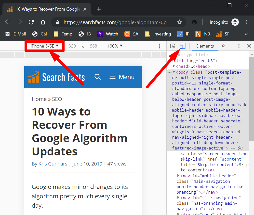
You can also check how your site looks at different screen sizes using Google Chrome. You right click on the page, click Inspect, then toggle the device toolbar to see how it looks at different screen sizes.
There’s also a useful tool called Screenfly that you can use to view and browse your site at different screen sizes.
Bottom Line: It is absolutely crucial to check your site on different devices, because sometimes the text can look vastly different. It is best to check the site manually on Mac, Windows, iPhone, iPad and Android devices.
Fonts can affect your site speed
It’s important to keep in mind that your font setup can affect your site speed.
Google fonts are fast, but if you load too many of them then it can add up to make your site noticeably slower.
I personally use only one Google font (Open Sans), which also happens to be cached on most devices because it is so commonly used.
A good rule of thumb is to use a maximum of 2 external fonts. Also make sure to only load the styles that you need, such as only “regular, regular italic, bold” and not the 10+ different styles.
If you use web-safe fonts or a system font stack then it won’t have any effect on your site’s loading times — the fonts will load instantly.
Bottom Line: Web fonts can affect your site’s loading times. Use a maximum of 2 external fonts and don’t load any unnecessary styles.
Take-home message
Some people find fonts to be a boring topic, as if they are a tiny detail that doesn’t matter that much.
But good fonts and font styles are incredibly important. They are the single most important determinant of the readability of your content.
If you have fantastic content but poor readability, then your website will never reach its full potential.
For this reason, you need to make sure that your website has great fonts that look good on all devices.